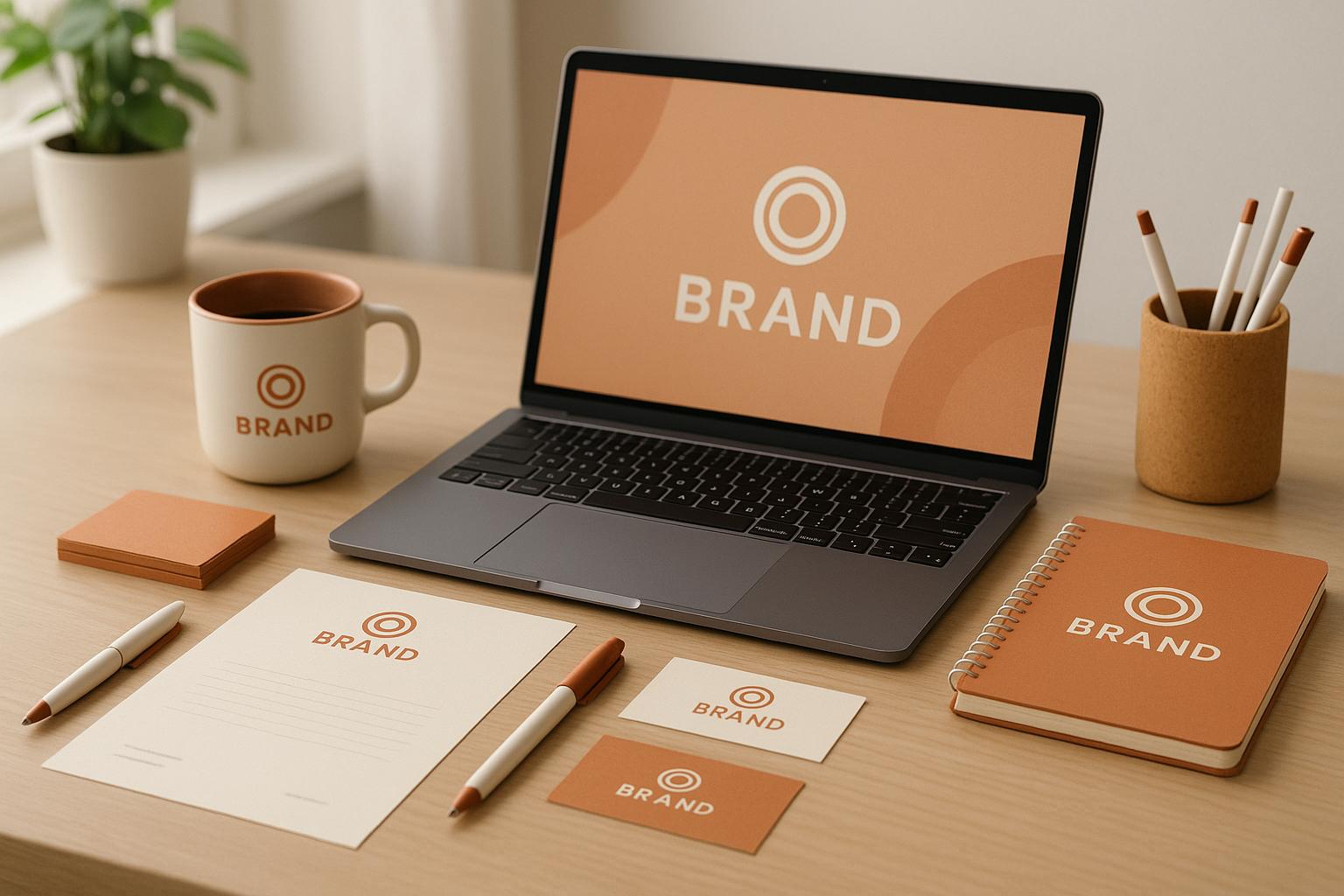
Visual consistency is the secret sauce behind memorable brands like Coca-Cola, Apple, and Nike. It’s about using the same colors, fonts, logos, and design elements across all customer touchpoints to make your brand instantly recognizable, trustworthy, and professional.
Why does this matter?
- Trust: 66% of consumers buy only from brands they trust.
- Recognition: Consistent colors alone can boost brand recognition by 80%.
- Revenue: Maintaining a unified look can increase revenue by 23%.
Achieving this starts with a brand audit, followed by clear style guidelines covering logos, color codes, typography, and imagery. Regular audits, AI tools, and team training keep things aligned. The payoff? A brand identity that sticks in people’s minds and builds long-term loyalty.
Let’s break down how to make it happen.
Visual Brand Guidelines: Create a Cohesive Brand Identity | Branded Agency
Core Elements of Visual Consistency
A consistent visual style – through your logo, color choices, and typography – plays a huge role in how customers see and remember your brand. Let’s break down these elements to better understand their impact on brand recognition.
Logo Design and Usage
Your logo is the heart of your visual identity – it’s often the first thing people associate with your brand. A great logo should be simple, easy to remember, and used consistently. This means sticking to clear guidelines for placement, size, and spacing to keep it looking sharp across all platforms.
Take Coca-Cola, for example. Its iconic red color and flowing cursive script have symbolized excitement and tradition for decades. On the other hand, Apple’s clean, minimalist logo paired with sleek sans-serif fonts sends a message of innovation and simplicity. When used consistently, these visual elements become powerful markers of identity.
Color Palette and Emotional Impact
Colors do more than make things look pretty – they tap into emotions and shape perceptions. Choosing the right color palette helps communicate your brand’s personality and connect with your audience. Using consistent color codes across all materials ensures your brand evokes the same feelings, no matter where it’s seen.
Look at National Geographic. Its bold yellow paired with clean serif fonts instantly brings to mind exploration and knowledge. By staying consistent with its colors, the brand creates strong, recognizable associations. Adjusting colors slightly for different platforms can also help maintain their visual strength without losing the essence.
Typography and Brand Personality
Typography isn’t just about how words look – it’s about how they feel. Fonts can reflect your brand’s personality, whether it’s a modern sans-serif for a tech company or a refined serif for a luxury brand. And it’s not just about style – legibility across different media is just as important.
Studies show that 75% of people see typography as a key factor in how they perceive a brand. Establishing a clear hierarchy with font sizes, weights, and styles helps guide attention and creates a seamless experience. As typography expert Robert Bringhurst once said:
"Typography is the craft of endowing human language with a durable visual form."
When combined, a well-designed logo, a thoughtful color palette, and consistent typography create a visual identity that’s easy to recognize and trust – helping your brand stand out in a crowded marketplace.
How to Achieve Visual Consistency
Creating visual consistency takes careful planning and attention to detail. It’s all about building an identity that people recognize instantly while addressing any gaps in your current approach. Here’s how you can make it happen.
Conducting a Brand Audit
Start by conducting a visual brand audit to spot inconsistencies. Collect all your visual assets – this includes websites, social media profiles, brochures, advertisements, packaging, presentations, and even internal documents.
Once you’ve gathered everything, organize these assets by design elements. Create separate groups for logos, colors, typography, graphics, and imagery. This side-by-side comparison will quickly reveal any mismatched elements. As Lara Kroeker from Forge and Spark explains:
"A visual brand audit is essentially a brand checkup."
During the audit, focus on details like logo proportions and spacing, as well as color variations between digital and print formats. Also, take a look at your competitors. This can help you identify ways to stand out visually. For instance, OneSpan chose a purple tone to differentiate itself from competitors who commonly used bright blue. Similarly, an industrial-products company realized that featuring employees collaborating with customers was a better way to highlight their expertise, rather than relying on generic product photos.
Finally, consider the challenges your team faces when creating visual content. Issues like unclear guidelines or hard-to-find brand assets often lead to inconsistencies. Use the insights from your audit to pinpoint these problem areas and address them in a style guide.
Creating a Visual Style Guide
Once you’ve identified inconsistencies, the next step is to create a visual style guide that ensures your brand looks cohesive everywhere.
A style guide acts as a roadmap for your brand’s visual identity, laying out clear rules to follow. Start by detailing logo usage. Include guidelines on which versions to use, where to place them, how to size them, and what to avoid. HubSpot’s style guide is a great example; it includes clear instructions for primary and secondary logos while showing what not to do.
Your color palette should also be precisely defined. Include hex codes for digital use, CMYK values for print, and Pantone colors for branded materials. This removes any guesswork and keeps your brand colors consistent across all mediums.
Typography is another key element. Specify which fonts to use for headlines, body text, and accents. Atlassian’s guidelines, for instance, map out font usage across operating systems and design scenarios, ensuring a unified look.
Don’t forget photography and videography. Outline the style you’re aiming for, technical specifications, editing preferences, and examples of on-brand imagery. Zendesk’s brand guidelines, for example, emphasize a clean, approachable aesthetic that helps their team maintain a consistent look.
Lastly, include web-specific guidelines. Define how design elements like buttons, navigation, and calls to action should look and function. Package these guidelines in a digital format so they’re easy to share and enforce across your team.
Applying Guidelines Across Channels
Even the best guidelines are useless if they aren’t applied consistently. Each channel – social media, email, print, and packaging – has unique requirements, but your brand identity should remain cohesive.
On social media, stick to your color palette, use consistent filters or editing styles, and maintain uniform logo placement and spacing. Templates that incorporate your brand’s colors, fonts, and logos can simplify content creation while keeping everything aligned.
For email marketing and digital communications, ensure your layouts adapt seamlessly to different screen sizes. Use images that scale well and typography that stays readable on mobile devices. Pre-approved design components can help maintain consistency across campaigns.
In print materials and packaging, pay close attention to color accuracy and typography. Work with vendors who understand your brand standards, can match your Pantone colors, and follow logo reproduction guidelines for various sizes and materials.
Consistency doesn’t stop once the guidelines are in place. Regular monitoring and audits are essential. Research shows that 90% of potential customers expect a consistent experience across all platforms, and brands that deliver this can see a 23% increase in revenue. Regularly revisiting your brand’s visual identity ensures it stays on track.
sbb-itb-593149b
Benefits of Visual Consistency for Brand Recognition
When brands keep their visuals consistent across all platforms, it has a direct impact on how customers perceive, remember, and trust them.
Improving Brand Recall
Using consistent visuals helps your audience instantly recognize your brand. By sticking to the same colors, fonts, and design elements, you create a visual identity that people can quickly associate with your company. In competitive markets, this kind of recognition gives you an edge.
Think about how this works with some of the biggest brands. Nike’s swoosh, McDonald’s golden arches, and Netflix’s bold red paired with its custom font are instantly identifiable across ads, apps, and even merchandise.
Color plays a huge role here. Research indicates that 90% of a consumer’s first impression is based on color. That’s why companies like Coca-Cola have stayed loyal to their signature red for decades – it’s not just a design choice; it’s a branding strategy.
As marketing expert Jessica Wong puts it:
"Consistency in branding is the building block of several major aspects of successful branding."
Every time your audience encounters your consistent visuals, it reinforces their memory of your brand. Over time, this repeated exposure makes your brand stand out and stick in their minds. And beyond recognition, it sets the stage for building trust.
Building Consumer Trust
Consistency doesn’t just make your brand memorable – it also builds trust. When your branding looks the same across every touchpoint, it sends a message of reliability and professionalism. Customers are more likely to trust a brand that appears consistent and detail-oriented.
In fact, consistent branding can increase revenue by up to 23%, and 71% of U.S. consumers are more likely to make repeat purchases from brands they trust. By strengthening both recall and trust, a consistent visual identity turns first-time buyers into loyal customers.
Flexibility vs. Consistency: Key Trade-Offs
While visual consistency is essential for recognition and trust, brands sometimes need to adapt to stay relevant. Striking a balance between consistency and flexibility is crucial for long-term success.
| Aspect | Strict Visual Consistency | Creative Flexibility |
|---|---|---|
| Benefits | Builds strong recognition, fosters trust, simplifies marketing | Appeals to varied audiences, adapts to changing contexts |
| Drawbacks | Limits creative innovation, can feel outdated, harder to rebrand | Risks diluting identity, may confuse audiences |
| Best Suited For | Stable, reliable industries (e.g., finance, healthcare) | Brands in dynamic or diverse markets |
| Revenue Impact | High consistency can lead to 10%+ revenue growth | Responsive branding boosts awareness significantly |
The challenge lies in knowing where to draw the line. As Brandfolder explains:
"When it comes to your brand’s mission and values, consistency is crucial–there’s no denying that. However, the experience your brand provides in different contexts should greatly vary."
Some brands excel at this balancing act. Spotify, for instance, uses a flexible system with multicolored visuals but applies a consistent image filter to maintain its distinct look. Similarly, MailChimp adapts its mascot Freddie’s appearance for different situations while keeping his iconic blue hat and friendly smile intact.
The secret is deciding which elements should stay constant and which can evolve. Core features like your brand’s primary colors, logo, and typography might remain fixed, while secondary graphics, imagery, or contextual designs can adapt to keep your branding fresh and relevant.
Measuring and Maintaining Visual Consistency Over Time
Once you’ve established your visual identity, the challenge lies in keeping it effective as your brand grows. The real value of visual consistency comes from measuring its impact and ensuring it remains intact over time.
Measuring the Impact of Consistent Branding
To gauge how well your visual identity is working, focus on clear metrics. Tools like brand recognition scores and message consistency scores can reveal how effectively your brand stands out in the market.
Begin with brand recognition surveys. These surveys test whether customers can identify your brand among competitors, turning qualitative insights into trackable data. For example, consistent use of colors can boost brand recognition by as much as 80%.
Another essential step is auditing your content across all communication channels. This helps pinpoint where your brand guidelines are being followed and where they may be slipping. Natural Language Processing (NLP) tools can also verify if your messaging aligns with your visual identity.
Practical metrics provide further insights. For instance, measure how long it takes your teams to create new pages using brand-approved components compared to starting from scratch. Also, compare error rates between pages built with and without your design system. A case in point: Siteimprove‘s rebrand led to noticeable improvements in search visibility, organic traffic, and conversion rates.
Social media monitoring tools add another layer of understanding. Tracking engagement rates, brand mentions, and sentiment analysis can help you see how your audience perceives your brand and whether your consistent messaging is resonating.
Tools and Methods for Long-Term Consistency
Once you’ve measured your brand’s impact, the next step is maintaining it. Digital Asset Management (DAM) systems and pre-built templates are key to keeping all brand assets up-to-date and applied consistently .
Templates act as creative guardrails, ensuring that teams stick to the brand guidelines during execution .
AI-powered tools are another game-changer. These tools can automatically check for exact color codes, font usage, and approved design elements across your digital presence. Unlike manual reviews, which can struggle with scale, AI systems can efficiently handle these tasks across large digital platforms.
| Tool/Method | Primary Function | Key Benefit |
|---|---|---|
| Digital Asset Management | Store and organize brand assets | Easy access to approved materials |
| AI-Powered Monitoring | Automated consistency checks | Identifies inconsistencies across large platforms |
| Design Systems | Reusable components and patterns | Ensures visual uniformity and speeds up design |
| Content Audit Tools | Review materials for alignment | Detects deviations from brand guidelines |
Design systems, with their library of reusable components, are especially effective for maintaining visual consistency across all platforms and touchpoints. They provide teams with pre-approved elements, making it easier to create new materials that align with your brand .
Regular brand audits are also essential. Whether done quarterly or biannually, these reviews help catch inconsistencies before they become major issues. Monitoring your brand hub’s usage statistics can also reveal how frequently your team references core branding guidelines.
Team Training and Collaboration
Even the best tools are only as effective as the people using them. Regular training ensures that everyone on your team understands the importance of consistency and knows how to implement it.
A detailed style guide is a must. Include specifics like hex codes for colors, font sizes, and logo usage, and make it easily accessible to everyone involved in content creation. Studies show that structured training programs can improve team collaboration by 30%.
Appoint a "brand keeper" – a dedicated person or committee responsible for updating brand guidelines and ensuring consistency across all materials. This role acts as the go-to resource for any brand-related questions or decisions.
"Maintaining branding consistency creates trust, improves brand recognition and increases customer loyalty in every industry. Prioritizing consistency will help you build a strong brand that is instantly recognizable and beloved by its audiences." – Jessica Wong, Forbes Councils Member
Collaborative tools that allow real-time teamwork and instant feedback are invaluable. Regular video calls to discuss new projects and review brand guidelines can help keep everyone aligned.
Feedback sessions are another effective strategy. They provide an opportunity for team members to share their thoughts on brand perception and suggest improvements. This kind of collaboration helps catch potential issues early.
Finally, schedule regular check-ins to review and update your brand guidelines. Keeping your standards in line with industry trends and business changes ensures your brand stays relevant. Brands that maintain high consistency levels have been shown to achieve an average revenue increase of 23%.
Conclusion: The Power of Visual Consistency in Branding
Visual consistency isn’t just about aesthetics – it’s a smart business move that directly influences your bottom line. By keeping your visual elements cohesive across every platform and interaction, you shape a brand identity that people recognize instantly.
And the payoff? It’s measurable. Studies show that 91% of customers respond favorably to strong visual identities, and astonishingly, up to 90% of product judgments are influenced by color within 90 seconds.
"Design is the silent ambassador of your brand." – Paul Rand, Iconic Graphic Designer and Art Director
The real magic of visual consistency lies in the trust it builds. When your brand’s visuals are polished and consistent, it signals professionalism and attention to detail. That trust often leads to tangible results – brands that prioritize consistency can experience revenue boosts of 23% on average.
Practical examples back this up. Brands that unify their visual elements across all channels see improvements in search visibility, organic traffic, and even conversion rates.
The takeaway? Treat visual consistency as an ongoing priority, not a one-off task. Stick to your color palette, use the same typography, and ensure your design patterns stay consistent across every customer interaction. When done right, visual consistency becomes one of your brand’s greatest strengths – creating familiarity, gaining trust, and fostering the kind of loyalty that fuels long-term success.
"Consistency in graphic design is essential for building a strong brand identity. It enhances brand recognition, establishes professionalism, and fosters customer trust and loyalty." – Drew Medley, Diamond Group
FAQs
How can small businesses review their visual branding for consistency?
Small businesses looking to refine their visual branding can start with a brand audit. Begin by examining essential design elements like your logo, color palette, and typography. Are they consistent across all platforms? If not, it’s time to address those gaps. To keep everything aligned moving forward, consider creating a brand guide or board. This will serve as a handy reference to ensure your visual identity stays clear and unified.
After that, take a closer look at your digital presence. Check your website, social media profiles, and marketing materials for any inconsistencies. Does the overall messaging and content match the tone of your visual branding? If not, adjustments may be needed. Finally, don’t overlook the value of customer feedback. Asking your audience how they view your brand can reveal useful insights and areas where you might improve. A consistent and polished visual identity not only builds trust but also makes your brand more recognizable.
How can I create a clear and effective visual style guide for my team?
To build a solid visual style guide, begin by outlining your brand identity – this includes your logo, color scheme, typography, and imagery style. Clearly document how these elements should appear across all platforms to ensure a consistent look. For instance, define logo dimensions, permissible color variations, and specific font application rules.
Keep the guide straightforward and visually engaging by incorporating examples and brief instructions. Make it easily accessible for your team, and revisit it regularly to accommodate any updates to your brand or shifts in design trends. A well-organized style guide helps keep everyone on the same page and ensures your brand stays consistent and instantly recognizable.
How do AI tools help maintain visual consistency for brands across platforms?
AI tools are game-changers when it comes to maintaining visual consistency. They take care of repetitive design tasks and ensure brand elements – like colors, fonts, and layouts – stay consistent. By analyzing designs, these tools help keep everything aligned with your brand guidelines, creating a unified look across websites, social media, and other platforms.
On top of that, AI simplifies workflows by generating templates, spotting inconsistencies, and even offering suggestions to better reflect your brand’s identity. The result? You save time while building trust and recognition with your audience.