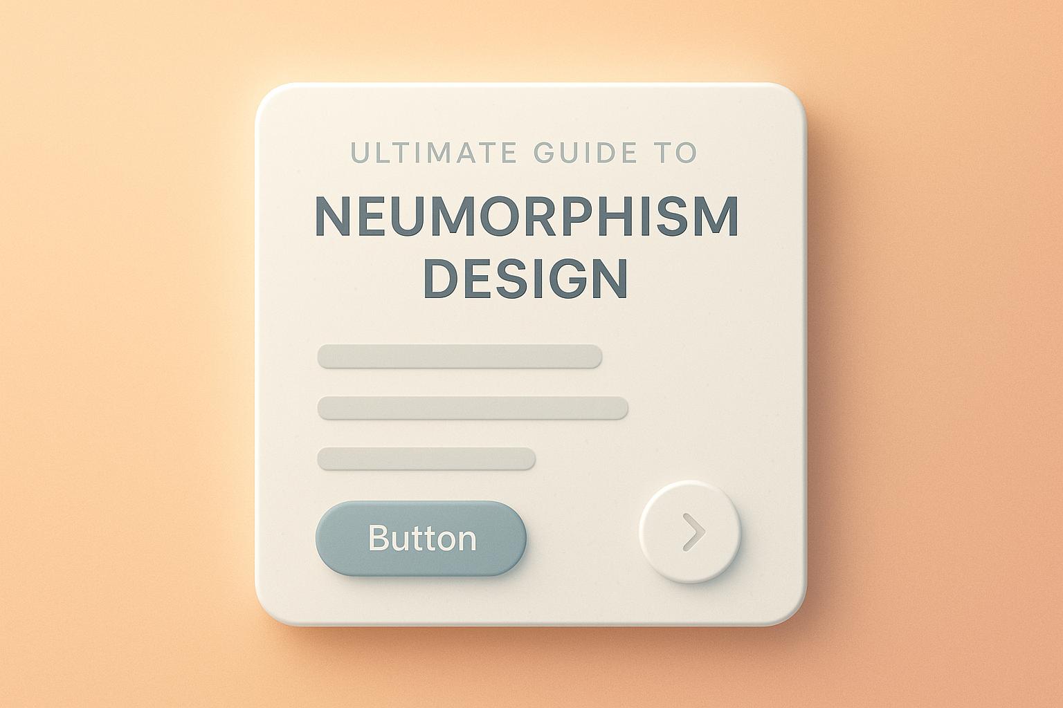
Neumorphism is a design style that blends skeuomorphism and flat design, creating soft, 3D-like UI elements that appear to rise or sink into the background. It focuses on minimalism, monochromatic colors, and subtle shadows for a sleek, modern look. Here’s what you need to know:
-
Core Features:
- Soft, dual shadows for depth.
- Monochromatic color schemes.
- Low contrast and minimalist layouts.
- Emphasis on 3D visual effects.
-
Design Rules:
- Use light and dark shadows for depth.
- Stick to consistent spacing (4px, 16px, 32px).
- Maintain simplicity with 2–3 depth levels.
-
Common Issues:
- Low contrast can hurt accessibility.
- Hard-to-recognize interactive elements.
- Performance challenges on mobile.
-
Solutions:
- Increase contrast and shadow intensity.
- Add clear hover and active states.
- Optimize for performance with fewer shadow layers.
| Design Aspect | Flat Design | Skeuomorphism | Neumorphism |
|---|---|---|---|
| Visual Depth | None | Heavy realism | Subtle extrusion |
| Color Range | Vibrant, varied | Realistic textures | Monochromatic |
| Shadow Usage | Minimal | Complex shadows | Dual soft shadows |
| Accessibility | High | Medium | Low to medium |
| Performance Impact | Light | Heavy | Medium |
Next Steps: Start small with buttons or input fields, use tools like Figma or Sketch, and prioritize accessibility and performance. Neumorphism works well for mobile apps, smart home interfaces, and financial tools when applied thoughtfully.
Basic Design Rules
Design Components
Neumorphic design relies on a few key elements. Start with a base color, typically a soft gray with an HSL lightness value between 85% and 92%.
To create depth, use two shadows: a light shadow (white, 20–30% opacity) and a dark shadow (black or dark gray, 10–15% opacity). Place these shadows on opposite corners, using offsets of 3–5px for a subtle effect or 8–12px for a more pronounced look. Adjust the blur radius between 10–20px, depending on the size of the element.
Stick to consistent spacing for a balanced design:
- 4–8px for closely related elements (micro spacing)
- 16–24px between components (standard spacing)
- 32–48px for major sections (macro spacing)
This setup forms the basis for comparing design styles in the next section.
Style Comparison
| Design Aspect | Flat Design | Skeuomorphism | Neumorphism |
|---|---|---|---|
| Visual Depth | None | Heavy realism | Subtle extrusion |
| Color Range | Vibrant, multiple | Realistic textures | Monochromatic |
| Shadow Usage | Minimal or none | Complex shadows | Dual soft shadows |
| Learning Curve | Low | Medium | Low to medium |
| Performance Impact | Light | Heavy | Medium |
Layout Structure
Consistency in spacing and alignment is key. Here are some recommended dimensions:
Primary Elements:
- Button height: 44–56px
- Padding: 1:2 ratio or 1:1.618 (golden ratio)
- Border radius: 8–16px
Content Organization:
- Group related elements inside inset containers.
- Ensure at least 24px spacing between interactive elements.
- Keep depth variations to 2–3 levels for simplicity.
The layout should naturally guide users through the content hierarchy. Larger elements with more pronounced depth effects grab attention, while smaller or secondary elements use softer extrusions to create a clear and logical visual flow.
Design Implementation Guide
Design Process Steps
Follow these steps to create neumorphic designs effectively:
- Base Setup
Start with an 8px grid to ensure consistent shadow alignment and spacing throughout your design.
- Shadow Configuration
Apply both light and dark shadows for a balanced effect:
- Light shadow:
rgba(255,255,255,0.25) - Dark shadow:
rgba(0,0,0,0.15) - Use an 8px offset and a 16px blur radius.
- Element Hierarchy
Organize your interface elements with these shadow offsets:
- Primary elements (e.g., buttons): 12px offset
- Secondary elements: 8px offset
- Tertiary elements: 4px offset
These settings can be applied using your favorite design tools to create a polished look.
Software and Tools
Use these tools to apply shadow and spacing configurations seamlessly:
| Tool | Key Features | Best For |
|---|---|---|
| Figma | Built-in effects, easy sharing | UI prototyping |
| Adobe XD | Dynamic symbols, auto-animate | Interactive mockups |
| Sketch | Plugin ecosystem, vector editing | Component design |
| CSS Generator | Live preview with code output | Web implementation |
Maintaining consistent spacing and shadow values will help your interactive elements stand out while keeping the overall design clean and visually appealing.
Common Issues and Solutions
Accessibility Challenges in Neumorphic Design
Neumorphic design often struggles with accessibility, presenting several challenges:
- Low Contrast Ratios: Many neumorphic interfaces have insufficient contrast, failing to meet the WCAG 2.1 minimum of 4.5:1 for normal text.
- Difficulty Identifying Interactive Elements: Soft shadows and minimal color differences can make it hard for users to recognize clickable areas.
- Lack of Clear Visual Hierarchy: The uniform style of neumorphic elements can make it difficult to establish a clear structure, which is crucial for navigation and understanding.
Improving Accessibility in Neumorphic Design
To make neumorphic designs easier to use while maintaining their aesthetic:
- Increase Contrast: Use darker or more pronounced shadows to improve visibility. Add subtle color differences to highlight interactive elements, and use icons or underlines to mark actionable areas.
- Add Clear State Indicators: Create distinct hover, focus, and active states by adjusting shadow intensity or background colors. These changes should align with accessibility standards to ensure usability.
Performance and Mobile Optimization
Neumorphic designs must balance visual appeal with performance, especially across different devices.
For Desktop
- Use fewer shadow layers to reduce rendering demands.
- Apply CSS custom properties to standardize shadow values.
- Leverage hardware acceleration for smoother animations and transitions.
For Mobile
- Scale shadow values appropriately for smaller screens.
- Ensure touch targets are at least 44×44 pixels for usability.
- Optimize shadow rendering by using hardware acceleration techniques, like
transform: translateZ(0).
Balancing accessibility and performance ensures a better experience for all users.
sbb-itb-593149b
Looking Ahead
New Design Approaches
Neumorphic design is evolving as designers combine its soft, tactile look with modern usability standards. The focus now is on balancing aesthetics with functionality and accessibility.
- Hybrid Neumorphism: This approach blends flat design with selected neumorphic elements, like interactive buttons, to create clear visual hierarchies without overwhelming users.
- Micro-Neumorphism: Subtle depth effects are applied to specific UI elements, such as buttons or input fields, for a clean and understated look.
- Dynamic Neumorphism: Shadows and depth adjust based on user interactions, adding a layer of responsiveness to the interface.
Design Examples
These techniques are already influencing practical applications, with some standout examples:
Smart Home Interfaces
- Panels featuring raised buttons with soft shadowing
- Circular dials for temperature controls
- Light switches with subtle depth effects
Financial Applications
- Embossed input fields for credit card forms
- Tactile-looking keypads for calculators
- Layered card designs for transaction history
Health and Fitness Apps
- Progress trackers with raised visual indicators
- Workout timers with dimensional controls
- Heart rate monitors with depth-enhanced displays
Design Trends Integration
Designers are incorporating neumorphism into broader trends to enhance both usability and aesthetics.
- Dark Mode Adaptation: Neumorphic design in dark mode uses inverted shadows and adjusted contrast to maintain depth while reducing eye strain, making it ideal for low-light environments.
- Minimalist Integration: Clean, simple layouts paired with selective neumorphic elements create modern interfaces that are visually appealing yet uncluttered.
- Responsive Neumorphism: As mobile-first design continues to dominate, neumorphic elements are being fine-tuned for various screen sizes and orientations. Adjustments include:
- Modifying shadow intensity based on device capabilities
- Scaling effects and touch targets to ensure consistency across devices
These approaches are paving the way for more polished and user-friendly neumorphic designs.
Conclusion
Summary
Neumorphism has grown into a design approach that blends visual appeal with practical functionality. This guide highlights how it uses soft shadows, subtle depth, and minimal color schemes to create polished interfaces. Success with this style depends on careful attention to details like:
- Ensuring contrast ratios support accessibility
- Mixing neumorphic elements with flat design for better usability
- Adjusting designs to fit various screen sizes and environments
- Using interactive elements to improve user experience
These principles can help you refine your design strategy.
Next Steps
Ready to put these ideas into action? Here’s how to get started:
-
Start small
Experiment with basic components like buttons or input fields. Try out different shadow settings while ensuring your designs remain accessible. -
Use the right tools
Work with design software that supports shadow effects. Build reusable components and document successful shadow combinations for consistency. -
Test and improve
Check your designs on various devices, collect user feedback, and fine-tune shadow intensities to match real-world usage.
Neumorphism Figma Tutorial
FAQs
How can I make my neumorphic design accessible for users with visual impairments?
To ensure your neumorphic design is accessible to users with visual impairments, focus on contrast and usability. Neumorphism often relies on subtle shadows and highlights, which can make elements harder to distinguish for users with low vision. Use sufficient contrast between the background and interactive elements, and consider adding clear outlines or borders to improve visibility.
Additionally, avoid relying solely on color or subtle depth effects to convey meaning. Instead, incorporate text labels, icons, or other assistive cues to make your design more inclusive. Testing your design with accessibility tools or guidelines, such as the Web Content Accessibility Guidelines (WCAG), can help ensure it meets accessibility standards.
What are some best practices for creating effective neumorphic designs on mobile devices?
To optimize neumorphic designs for mobile devices, focus on usability and performance. Keep the design subtle by using soft shadows and gradients to maintain a clean, modern look without overwhelming the user. Ensure accessibility by maintaining sufficient contrast between elements to make text and interactive components easy to see and use.
Additionally, prioritize responsive design to ensure the interface adapts well to various screen sizes and resolutions. Test for performance on mobile devices, as heavy use of shadows and effects can impact loading times and responsiveness. By balancing aesthetics with functionality, you can create an engaging and user-friendly mobile experience.
How can I combine neumorphic design with flat design to improve usability?
To effectively combine neumorphic design with flat design, focus on blending the strengths of both styles. Use neumorphism’s soft shadows and subtle gradients to create depth and a tactile feel, while leveraging flat design’s simplicity and clarity to ensure usability and accessibility.
For best results, apply neumorphic elements sparingly to key interface components, such as buttons or cards, to maintain visual hierarchy without overwhelming the design. Prioritize contrast and readability to ensure the interface remains user-friendly and functional.