Want more people to complete your signup forms? These 10 tips can help you boost conversions by making your forms simple, user-friendly, and effective. Here’s a quick summary:
- Use fewer fields: Cut unnecessary questions to reduce friction – fewer fields can increase conversions by up to 120%.
- Single-column layout: Easier to read and faster to complete compared to multi-column designs.
- Auto-focus on the first field: Guide users immediately to start typing, improving engagement.
- Mobile-first design: Optimize for touchscreens and smaller screens – 60% of web traffic is mobile.
- High-contrast CTA buttons: Make your call-to-action stand out for better visibility and clicks.
- Social media login options: Simplify signups with one-click logins via Google, Apple, or Facebook.
- Multi-step forms with progress bars: Break long forms into steps to reduce overwhelm and show progress.
- Clear error messages: Help users fix mistakes easily with actionable, blame-free instructions.
- Conditional logic: Personalize forms by showing fields or incentives based on user input.
- Real-time validation: Provide instant feedback to prevent errors and improve form completion rates.
By focusing on usability, reducing friction, and testing improvements, you can turn your signup forms into conversion machines. Even small tweaks – like removing one field – can make a huge difference.
Pro Tip: Test your forms regularly to find what works best for your audience!
10 Tips to Increase Form Conversions
1. Use Fewer Form Fields to Reduce Friction
Nothing drives potential subscribers away faster than a form overloaded with fields. The more fields you include, the lower your completion rates. In fact, over 25% of users abandon long forms entirely. Here’s the kicker: switching from four fields to just three can boost conversion rates by nearly 50%.
Take Expedia, for example. They removed a single field from their booking form – the one asking for the company name – and ended up generating an extra $12 million per year. That’s the power of keeping things simple.
Chargebee also saw massive results by asking for just an email during signups. This small tweak doubled their signup rates. The lesson? Stick to the essentials. Usually, all you need is a name and an email address. Anything more can wait.
What about the extra details like phone numbers, job titles, or demographic info? You can always gather that later through follow-up emails, profile updates, or progressive profiling. The key is to make the initial signup process as smooth as possible. Think of it like a transaction: users give you minimal, yet valuable, information in exchange for immediate access or benefits.
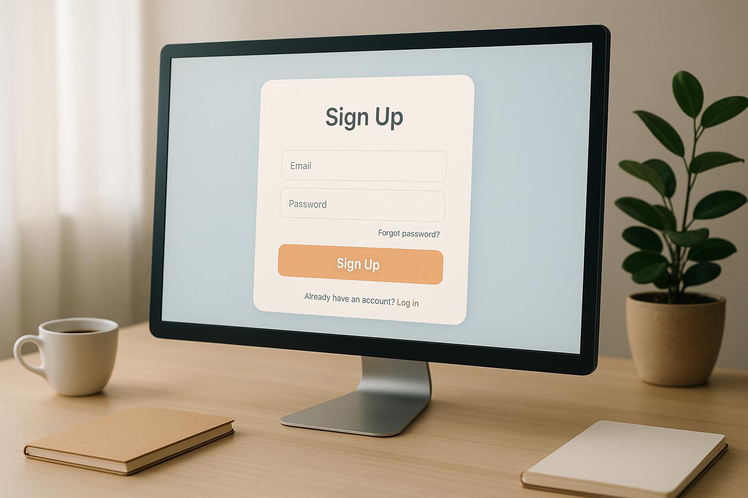
2. Use Single-Column Layouts for Better Readability
Simplifying your signup process doesn’t just stop at reducing the number of fields. The layout of your form plays a crucial role in shaping the user experience. Single-column layouts consistently outperform their multi-column counterparts, offering a clear and logical path for users to follow.
According to research from the Baymard Institute, single-column forms deliver better results compared to multi-column designs. A study by CXL found that participants completed single-column forms an average of 15.4 seconds faster than multi-column ones – a difference that’s statistically significant at a 95% confidence level. These findings highlight how a streamlined layout can greatly enhance usability.
The reasoning behind this is simple: single-column layouts organize content vertically, guiding users naturally through the form. This straightforward structure eliminates unnecessary visual clutter and reduces the cognitive load, sparing users the effort of figuring out where to focus their attention.
Why multi-column forms fall short:
- They distract users, making the form harder to interpret.
- They increase the likelihood of errors, such as skipped fields or incorrect inputs.
- They’re harder to scan, forcing users to look both horizontally and vertically.
Despite these drawbacks, 16% of e-commerce sites still rely on multi-column forms in their checkout process.
Single-column layouts also shine when it comes to mobile optimization. These designs naturally adapt to smaller screens, making them an excellent choice for mobile users, which now account for a significant portion of web traffic. By sticking to a single-column structure, you ensure a smoother experience across all devices.
This approach minimizes errors and improves completion rates by presenting fields in a logical, easy-to-follow sequence that aligns with how users naturally process information. To get the most out of your single-column form, arrange fields in a thoughtful order – start with basic details like name and email, then move on to additional information as needed.
3. Auto-Focus on the First Input Field
When it comes to creating a smooth user experience, getting users to dive into your form right away is crucial. Often, users hesitate when faced with a signup form. By auto-focusing the first input field, you eliminate that initial hurdle, placing the cursor exactly where they need to start typing. This simple tweak can significantly improve engagement and completion rates.
Why does this work so well? The logic is simple: 95% of users opening a signup form will instinctively click into the first field. By auto-focusing on that field, you save them the effort of making that click, providing a clear and immediate starting point.
This approach ties directly into a key principle of interaction design. Erik D. Kennedy from Learn UI Design sums it up perfectly:
"Ironically, the fundamental rule of interaction design is: remove interaction. Remove clicks, remove reading, remove waiting, remove thinking."
Auto-focus embodies this idea by removing unnecessary steps and simplifying the process.
For users who rely on keyboard navigation, auto-focus is especially helpful. It directs their attention straight to the most important part of the form, ensuring the workflow kicks off smoothly. That said, while this feature improves usability, it’s essential to address accessibility concerns.
To make auto-focus work seamlessly, the focused field should stand out visually. This can be achieved through techniques like accented border colors or subtle fade-in effects – something companies like Amazon execute effectively. However, accessibility must remain a priority. For instance, screen readers may misinterpret sudden focus changes, potentially confusing users with visual or cognitive impairments. To avoid such issues, ensure your form starts at the top of the page, doesn’t cause unwanted scrolling on smaller screens, and that the auto-focused field is genuinely critical for all users.
When done thoughtfully, auto-focus reduces friction, guides users effortlessly, and encourages immediate interaction.
4. Design for Mobile-First Responsiveness
With more than 60% of web traffic coming from mobile devices, ensuring your forms are optimized for smaller screens isn’t just a good idea – it’s essential. If your mobile form isn’t user-friendly, 61% of users will abandon it, and 40% might even head straight to a competitor.
Mobile-first responsiveness means your form should automatically adjust to look and function its best, no matter the screen size. This requires rethinking how users interact with your form on touchscreens.
Here are some key guidelines:
- Touch-friendly design: Make sure buttons and other touch targets are at least 48 pixels (around 0.4 inches) square and spaced 32 pixels apart. This reduces the chance of accidental taps.
- Readable text and labels: Place labels directly above each input field and use a font size of at least 16 pixels to ensure readability.
- Streamlined performance: Mobile users expect speed – over 50% won’t wait more than 3 seconds for a page to load. Avoid large images or unnecessary media that could slow things down, and keep the design clean and distraction-free.
When designing for mobile, think about thumb reach. Place your primary call-to-action button where it’s easy to tap, typically in the bottom half of the screen. Also, ensure buttons and fields provide immediate feedback when tapped or completed, so users know their actions are registering.
Finally, test your form across various devices and screen sizes during development. Mobile users are often multitasking or in busy environments, so aim to make every interaction simple, intuitive, and quick to complete. Reducing cognitive load can make all the difference in keeping users engaged.
5. Use High-Contrast Colors for CTA Buttons
The color of your call-to-action (CTA) button can significantly influence the performance of your signup form. Research shows that users form opinions about buttons in just 50 milliseconds, so making an immediate visual impact is critical.
High-contrast colors are particularly effective because they create visual saliency – essentially, they make your button stand out. When your CTA button sharply contrasts with the background, it naturally grabs attention.
Studies back this up: heat maps show that high-contrast elements get 23% more clicks compared to low-contrast ones. Similarly, eye-tracking data reveals users spend 42% more time focusing on colorful designs than on monochrome layouts.
"Color and contrast show relationships between items, establish importance, and most importantly draw attention. Color is also an excellent way to show a continuing path."
- Jennifer Fleming, Author of Web Navigation: Designing the User Experience
Picking the Right Color
Choosing the right button color is all about contrast. While red and orange are popular choices, the most effective color depends on how it contrasts with the rest of your page’s design. For example, HubSpot‘s 2011 A/B test found that a red button outperformed a green one by 21%. Why? Because the page’s dominant color was green, and the red button stood out more.
Accessibility Matters
Beyond just aesthetics, high-contrast buttons play a key role in accessibility. Around 20 million Americans live with vision impairments, meaning poor contrast can exclude 8% of the U.S. population – and reduce your conversion opportunities.
To make your buttons accessible, follow WCAG guidelines for contrast ratios. Aim for at least:
- 4.5:1 for normal text
- 3:1 for large text (Level AA compliance)
For even better accessibility, strive for Level AAA compliance, which requires:
- 7:1 for normal text
- 4.5:1 for large text
Tools like WebAIM‘s Contrast Checker can help you test and fine-tune your button colors before launch. Make sure every element on the button contrasts effectively with its surroundings.
Pro Tips for Effective CTAs
- Combine high contrast with clear, concise button text, proper sizing, and strategic placement. For example, black text on a white background has a 70% higher readability rate than lower-contrast combinations.
- Avoid relying on color alone to convey meaning. Add visual cues like bold text or icons to ensure clarity for all users.
- Use A/B testing to experiment with different color combinations. What works for one brand might not work for another, so let user behavior guide your decisions.
6. Add Social Media Login Options
Social media login options can turn a daunting signup process into a seamless entry point. By offering one-click access through users’ existing social accounts, you make registration faster and simpler.
Here’s the reality: 76% of users abandon registration when asked to create a password. At the same time, social login accounts for about one-third of all sign-in events online, and implementing it correctly can increase conversions by up to 40%. This approach works especially well with mobile-first designs, where reducing friction is key.
Why Users Prefer Social Login
It boils down to convenience and speed. No one likes remembering yet another password or filling out long forms – this is even more frustrating on mobile devices. Social login eliminates those steps. As Wharton marketing professor Ron Berman explains:
"Because screens are small, the larger the hassle it is to purchase, the lower the purchase propensity on mobile phones."
Additionally, seeing familiar logos like Google, Apple, or Facebook builds trust. These recognizable brands reassure users that their information is in safe hands.
Selecting the Right Platforms
Not all social login options are created equal. Google leads the pack with 90.8% of social authentications, followed by Apple at 8.8%. For most websites, starting with these two platforms will cover the majority of users.
That said, your audience matters. If your platform is geared toward professionals, LinkedIn might be the better choice. For developer-focused tools, GitHub could be more relevant. For example, one enterprise saw social login rates triple after tailoring their options to their audience, while reducing reliance on password-based signups.
Best Practices for Implementation
To make the most of social login, follow these tips:
- Display social login buttons prominently at the top of your signup form.
- Use distinct, branded buttons for platforms like Google and Apple.
- Offer social login as an option – not the only choice – alongside traditional email signups.
If you want to go a step further, consider adding Google One Tap, which allows users to sign in with just one click without leaving your page. And don’t forget to prepare your backend for potential hiccups, like authentication failures, to ensure users don’t feel stuck.
Balancing Security and Privacy
While social login is convenient, it’s crucial to prioritize security. Enable two-factor authentication as a backup and stay informed about privacy updates from social platforms. These measures not only protect your users but also build trust in your platform.
Beyond authentication, social login offers valuable insights. You can collect data like names, email addresses, and even user interests – information that can help refine your marketing efforts. As entrepreneur Higinio Maycotte puts it:
"If login data is gold, social login data is platinum."
Just be sure to handle this data responsibly and transparently to maintain user confidence.
sbb-itb-593149b
7. Use Multi-Step Forms with Progress Indicators
When a signup form requires more detailed information, splitting it into multiple steps can significantly improve completion rates. Instead of overwhelming users with a long, intimidating form, multi-step forms break the process into smaller, more manageable chunks.
In fact, HubSpot found that multi-step forms deliver 86% higher conversion rates compared to single-step forms. The impact can be dramatic. For example, Bird Marketing swapped their basic WordPress contact form for a multi-step version and saw their conversion rate soar from 0.96% to 8.1% – a staggering 743% increase in leads.
Why Multi-Step Forms Work
The magic lies in reducing cognitive overload. By presenting questions in smaller, digestible steps, users feel less overwhelmed and more inclined to complete the process. Louis Pretorius from Bird Marketing explains:
"By breaking the form into multiple steps, multi-step forms reduce the cognitive load on users…making the form feel more manageable."
The Role of Progress Indicators
Adding progress indicators to multi-step forms can take their effectiveness to the next level. These indicators reduce uncertainty, keep users motivated, and create a sense of accomplishment. Research shows that when users see an animated progress indicator, they report higher satisfaction and are willing to wait up to three times longer than users without one.
Taige Zhang, Senior Product Manager at Shipt, highlights their importance:
"If I had to pick out the most effective tool for onboarding a user, it would be the progress bar."
Dr. Hugo Liu from MIT adds:
"It turns out that when you finish a complex task, your brain releases massive quantities of endorphins."
Real-World Success Stories
The impact of multi-step forms with progress indicators is evident in various industries. For instance, Instapage conducted an A/B test on their Enterprise Demo landing page with over 25,500 visitors per variation. The multi-step form delivered an 18% increase in conversion rates.
Similarly, Vendio improved their leads by 214% after testing a multi-step signup process for their website building tool. BrokerNotes achieved even more dramatic results, boosting their conversion rate from 11% to 46% using multi-step forms.
These examples show how thoughtful design can lead to measurable success.
Best Practices for Multi-Step Forms
To ensure your multi-step forms perform well, follow these tips:
- Limit each step to 5–9 fields to keep the process manageable.
- Start with straightforward questions to build user confidence.
- Group similar questions together to maintain focus.
For progress indicators, make sure they are clearly visible and show the user’s current position. Options like percentage bars, step counts, or visual trackers work well. Include "Previous" and "Next" buttons for smooth navigation, and ensure user input is saved when moving backward.
Finally, design the progress indicator to show rapid progress early on and slow down toward the end. This approach helps reduce drop-off rates, as users feel an early sense of accomplishment.
8. Write Clear Error Validation Messages
Error messages play a crucial role in ensuring a smooth user experience. Just like intuitive layouts and helpful input guidance, well-crafted error messaging can significantly reduce frustration and encourage users to complete forms or processes. When users encounter issues, clear and actionable error messages can turn confusion into progress.
Confusing or vague error messages can hurt conversion rates. For instance, when someone makes a mistake on a signup form, a poorly worded message can lead to abandonment. On the other hand, a clear, helpful message can guide users toward resolving the issue and completing their task. The goal is to assist, not criticize.
Vitaly Friedman, author at Smashing Magazine, highlights the importance of error messages:
"Error messages need to be easy to spot, but they also need to be helpful… a strategic and thorough design of these messages can be critical for businesses, especially if they struggle with high abandonment. Error messages can make or break the experience in situations when things go south."
The Anatomy of Effective Error Messages
For an error message to be effective, it needs to be:
- Readable: Use plain language that’s easy to understand.
- Specific: Clearly state what went wrong.
- Actionable: Offer a solution or next step.
- Blame-Free: Focus on solving the issue, not assigning fault.
For example, if a user enters an incomplete credit card number, a message like "Your card number is incomplete" is far more helpful than a generic "Invalid card number." It tells users exactly what they need to fix.
Tailored Error Messages That Guide Users
Error messages should adapt to the specific mistake a user makes. This approach helps users understand the issue and how to resolve it. For example:
- Instead of saying "Provide a Valid Phone Number" when special characters are entered, Sony’s signup form clarifies with "The entry can only contain numbers."
- If a user tries to log in with an email and password for an account typically accessed via social media, Doodle provides a helpful nudge: "It seems like you usually log in with Facebook or Gmail with that email."
These tailored messages not only address the problem but also create a more intuitive and user-friendly experience.
Real-World Examples of Great Error Messaging
Some companies excel at crafting error messages that are both helpful and user-focused:
- Spotify: Their payment error messages use empathetic language, starting with "We have a little problem", followed by "Your payment has failed" and clear instructions like "Please make sure we’ve got your details right."
- Slack: Adds personality with messages like "That photo is too large. Try a different one", paired with straightforward call-to-action buttons.
- Dropbox: Keeps things simple and clear, using prompts like "Double-check your email address format" and providing examples to guide users.
Tips for Writing Effective Error Messages
When creating error messages, precision and clarity are key. Here are some best practices:
- Be direct. Instead of saying "Invalid phone number", specify the issue, like "Phone number is too short."
- Provide clear instructions. For example, Target’s address validation points out missing details, such as a street or apartment number.
- For password fields, include both visual and programmatic guidance. Use attributes like
minlengthandmaxlengthto set character limits, and implement inline validation to notify users immediately if their input doesn’t meet requirements.
Avoid casual phrases like "oops" or "whoops", as well as excessive punctuation or ALL CAPS, which can come across as unprofessional or alarming. Instead, focus on guiding users with actionable steps to resolve the issue. For example, show them exactly what needs to be corrected without assigning blame, ensuring a smoother and more supportive experience.
9. Offer Incentives with Conditional Logic
Conditional logic takes ordinary signup forms and turns them into dynamic, personalized experiences by showing tailored rewards or additional fields based on what users input.
Why does this matter? Personalized marketing has been shown to increase revenue by up to 15% and convert 60% of consumers into repeat buyers. By offering tailored incentives, you can encourage more people to complete your forms.
How Conditional Logic Creates Targeted Incentives
Conditional logic ensures users only see fields and offers that are relevant to them. For example, in a job application form, if someone selects "Graphic Designer" as their role, the form might prompt them to upload a portfolio. Similarly, an event registration form could ask additional questions if the attendee selects "Speaker" as their role. These interactions keep the process streamlined and engaging.
Real-World Applications That Deliver Results
Here are some practical examples of how conditional logic can be applied:
- College Applications: Show GPA or test score fields based on the applicant’s academic status.
- Mortgage Applications: Display income verification requirements based on whether the applicant is self-employed or salaried.
- Employee Onboarding: Reveal fields for dependents and health insurance coverage when a new hire selects family coverage options.
The Power of Personalized Incentives
A whopping 73% of customers prefer brands that personalize their communications. Amanda Reed highlights this in her statement:
"Personalized marketing helps to build strong customer loyalty by making your customers feel valued and appreciated."
This emotional connection isn’t just nice – it’s effective. Personalized emails, for instance, are six times more likely to convert than generic ones. Similarly, signup forms that adapt to user input can significantly boost conversion rates.
Implementation Strategies for Better Results
To get the most out of conditional logic, identify key points in your signup process where user input can guide the experience. For example:
- In a mortgage application, ask about employment type and then display specific income verification requirements.
- For employee onboarding, reveal fields for dependents and coverage options when family status information is provided.
Offer tailored incentives as soon as users share relevant details. With 89% of marketers reporting a positive return on investment from personalization, conditional logic can make your forms more effective and user-friendly. This approach not only increases conversions but also lays the groundwork for improving form usability even further.
10. Add Real-Time Input Validation
Real-time input validation is the cherry on top when it comes to creating smooth and frustration-free signup forms. By flagging errors as users type, this feature provides instant feedback, keeping users engaged and reducing the chances of them abandoning the process. It complements earlier strategies by ensuring a seamless and error-free experience.
Here’s why it matters: studies reveal that real-time validation can boost success rates by 22%, cut errors by 22%, reduce completion times by 42%, and lower form abandonment by up to 70%.
Why Real-Time Validation Is So Effective
Traditional validation methods often leave users in the dark until they’ve completed the entire form, only to discover errors at the end. Real-time validation flips the script by checking inputs as they’re entered. This not only ensures data accuracy but also enhances security by blocking malicious entries.
But there’s more to it than just functionality. The psychological impact is equally important. As one Everlane test participant shared:
"I do like it whenever it has a little checkbox, or an icon, or something that’s green where it’s like, okay, yep, that kind of confirms that I didn’t mistype a number."
This kind of immediate positive reinforcement gives users a sense of accomplishment, motivating them to finish filling out the form.
How to Implement Real-Time Validation Effectively
To make real-time validation work without annoying users, timing is everything. Avoid giving feedback too soon – wait until users start typing in a field. Once they move on, confirm corrections immediately and flag errors only after they’ve exited the field. Better yet, make error messages disappear as soon as the issue is resolved, ideally on a keystroke-by-keystroke basis.
Tips for Developers: Balancing Functionality and Usability
For developers, the challenge is to provide feedback promptly without overwhelming users. HTML5 offers built-in validation tools, but JavaScript allows for more flexible and tailored rules. Libraries like Formik, Yup, and jQuery Validate can also simplify the process.
For instance, email validation can kick in after the "@" symbol is entered to ensure proper formatting. Asynchronous validation can even check server-side data in real time, which is especially useful for confirming unique usernames or email addresses.
Design Strategies That Drive Conversions
Good design makes validation not just functional but also user-friendly. Here are some design tips to keep in mind:
- Place error messages close to the relevant field for clarity.
- Use red for errors and green for confirmations, but pair colors with icons or text for accessibility.
- Add micro-validations, like subtle icons or hints within the input field, to guide users as they type.
- For more complex fields, a green checkmark and a short success message can reinforce correct entries.
- Position validation messages to the right or directly below the input field where users naturally look for feedback.
Tackling Common Challenges
Despite its benefits, real-time validation is still underused – 31% of websites don’t include it. Concerns about disrupting the user experience often hold developers back. However, it’s particularly effective for fields like email addresses, passwords, dates, and phone numbers, which are common sources of user frustration.
For longer inputs, consider adding a "Validate" button that lets users check their entries when they’re ready. This approach provides control while still offering real-time feedback. Also, allow users to override live validation if necessary and ensure pasted data is automatically cleaned and validated.
Real-time validation ties everything together, providing the final touch for user-friendly, high-conversion signup forms. By offering immediate feedback, it removes uncertainty and makes the process smoother for everyone.
Conclusion
Creating high-converting signup forms isn’t about dazzling users with intricate designs or flashy features. It’s about understanding their needs and removing every obstacle between them and completing the form. The strategies we’ve discussed all boil down to one simple truth: a user-focused, straightforward design is key to driving conversions.
Research backs this up. Small changes, like reducing the number of form fields, can lead to massive improvements. For instance, cutting fields from 11 to 4 can result in a 120% increase in conversions. Similarly, trimming a form from 9 fields to 5 boosted conversions by 34%. Even reducing just one field – from four to three – can improve conversion rates by nearly 50%. These numbers are more than impressive – they can make a real difference for your business.
As Ben Zettler, Founder of Zettler Digital, wisely points out:
"Always, always, always test. There’s always something you can find out that will maybe surprise you about how you format a sign-up form."
Testing is crucial. By experimenting with different versions of your forms and tweaking one element at a time, you can figure out exactly what resonates with your audience. This method not only boosts conversions but also builds trust by showing users that their experience matters.
Accessibility is another critical piece of the puzzle – it ensures everyone, including users with disabilities, can interact with your forms. On top of that, clear error messages and progress indicators reduce frustration and make the process easier. Add in thoughtful incentives and options like social login, and you’ve got forms that feel effortless to complete.
Remember, signup forms are often the first real interaction users have with your brand. A poorly designed form can cost you dearly. Just ask Expedia – they lost over $12 million annually because of one unnecessary field in their registration form.
To turn your forms into lead-generating powerhouses, focus on the fundamentals: reduce friction, optimize for mobile, and test relentlessly. Whether you’re revamping an old design or starting from scratch, these strategies will help you capture more leads and grow your business.
For more tips on design, user experience, and conversion optimization, check out the resources available on Inspiretopics.
FAQs
What are the best ways to decide which fields are necessary for my signup form to improve conversions?
How to Design a High-Converting Signup Form
When creating a signup form that drives results, simplicity is key. Stick to the essentials – ask only for the information you truly need, like a name and email address. The shorter the form, the better; ideally, keep it to just 3–4 fields. This streamlined approach makes it easier for users to complete the form, boosting your chances of success.
Pay close attention to the form’s design and usability. A single-column layout works best for clarity, paired with clear labels for each field. Adding real-time validation is another smart move – it helps users quickly identify and fix any mistakes, saving them frustration. And since so many people sign up via their phones, make sure your form is fully optimized for mobile devices.
Finally, a small but important detail: include a brief note about privacy. Let users know their information is safe with you. This simple reassurance can go a long way in building trust and encouraging signups. By focusing on simplicity and a smooth user experience, you can create a form that truly delivers.
What are the best ways to add social media login options while keeping user data secure?
To ensure social media login options are secure, it’s crucial to prioritize user data protection and privacy. Start by implementing two-factor authentication (2FA) for social media accounts. This adds an extra layer of security, making it harder for unauthorized users to access accounts even if passwords are stolen.
Encourage users to create strong and unique passwords for their accounts. Suggest using password managers to keep their credentials safe and organized. It’s also important to remind users to regularly check their privacy settings and limit the permissions they grant to third-party apps linked to their accounts. These straightforward measures can greatly enhance security while still providing the ease of social media logins.
What’s the best way to test and measure the success of changes to my signup form design?
How to Test and Measure Changes to Your Signup Form
If you’re looking to evaluate changes to your signup form, A/B testing is one of the most dependable tools in your arsenal. The idea is simple: create two or more versions of your form, tweaking just one element at a time – like the button color, layout, or headline. Then, compare how each version performs based on conversion rates. To get meaningful results, it’s crucial to run the test long enough to gather enough data for reliable insights.
Beyond A/B testing, keep an eye on key engagement metrics. For instance, track bounce rates, completion rates, and time spent on the form. These numbers can reveal how users are interacting with your form and whether the changes make their experience better. By analyzing these data points, you’ll be equipped to make smarter decisions that can lead to higher signup rates.